Job Flow
Interaction Design
Problem
The lack of visibility within the average job application makes it difficult for potential employees to know where they are within a particular job process and make well-informed job decisions. Things like application submission confirmation, if interviews have commenced, and replies back about receiving an offer or not are all important pieces of information job applicants would like to have as they apply. However, to create a well-informed process, the business must allocate time and resources to achieve this. A better and more transparent process would not only make it easier on the applicant but also increases the trust between potential employees and the company. So the overarching question we are trying to answer is how might we improve an applicant’s job process overall without sacrificing a company’s resources?
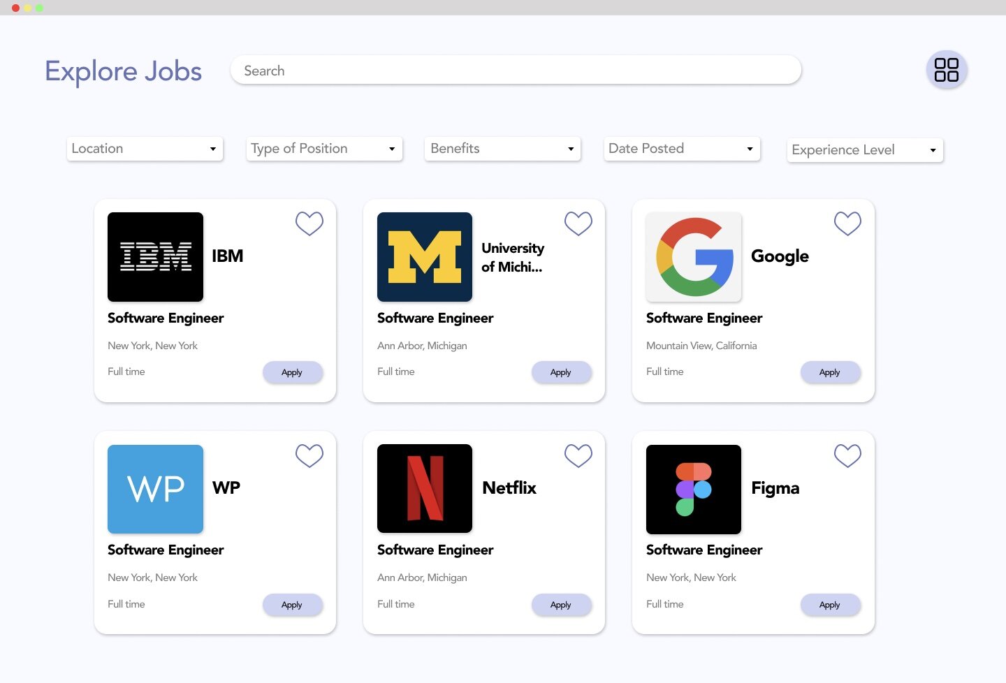
We began by planning out the overall flow of the site focusing on two main factors of the site: an explore page and a previously applied job page. From there we broke down each interaction and to better understand the purpose of each page and where it would take the user. A key located to the right of the page indicates the types of interactions and the overall flow of the site we initialized.
Personas
Prototypes and Wireframes
We first created some paper prototypes to plan for what we want the site to look like visually. A PDF is attached for better-detailed visibility.
We then used Figma to digitally build our individual wireframes and create a low fidelity prototype to find real-life users with backgrounds in UX to help us identify how to improve the site based on Nielson’s Heuristic Principles.
Using the feedback from the low fidelity prototype, we built out a style guide for our site and create a high fidelity prototype of the site to test on users that we thought would potentially use the site.
Usability Inspection
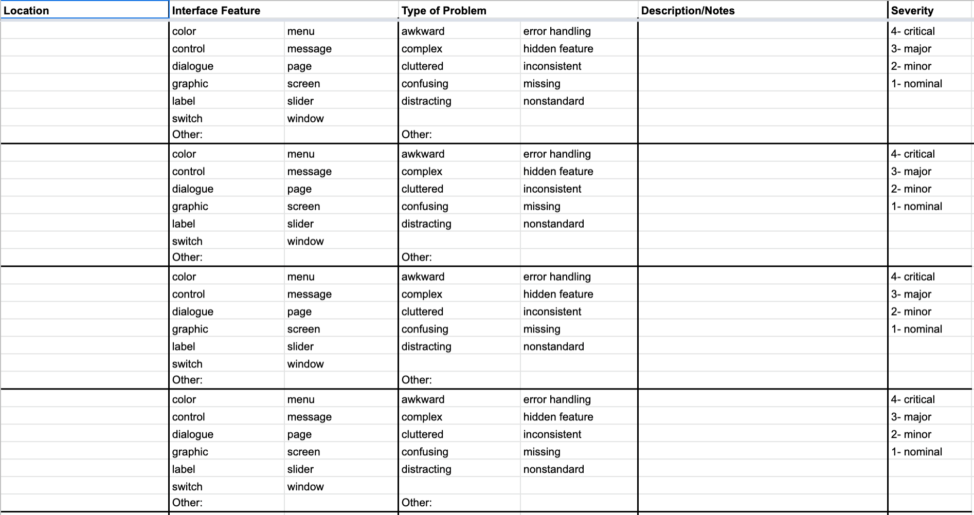
To test the effectiveness of the site amongst people that would be potential users of the site, each of our team members conducted 1-2 interviews with peers, particularly those who may not have a heavy design or UI background. We utilized the table to the left to evaluate the site prototype based on those interviews.
Final Prototype


The Team
Leila Boudalia, Angela Li, Shannon Li
January 2021 - April 2021


