Data Visualization Research and Design
Summer 2021
Internship Goals and Design Questions
As the company adopted a new outside data visualization team, my role was to conduct various interviews to research user needs on the company side as well as outward-facing clients. Interviews will continue as ongoing research throughout the internship and designs were completed in conjunction with the VP of UX Design as we continued to meet with clients and work along with the Project Manager to arrange deadlines and project needs. Some questions to try to answer through the research and design are:
In what ways can we better visualize student data to create a hub of information for our clients to refer to any time during the application cycle?
How can we create a data dashboard that has various layer of information while being easy to read and interpret for all types of audiences and expertise level?
Initial Wireframes
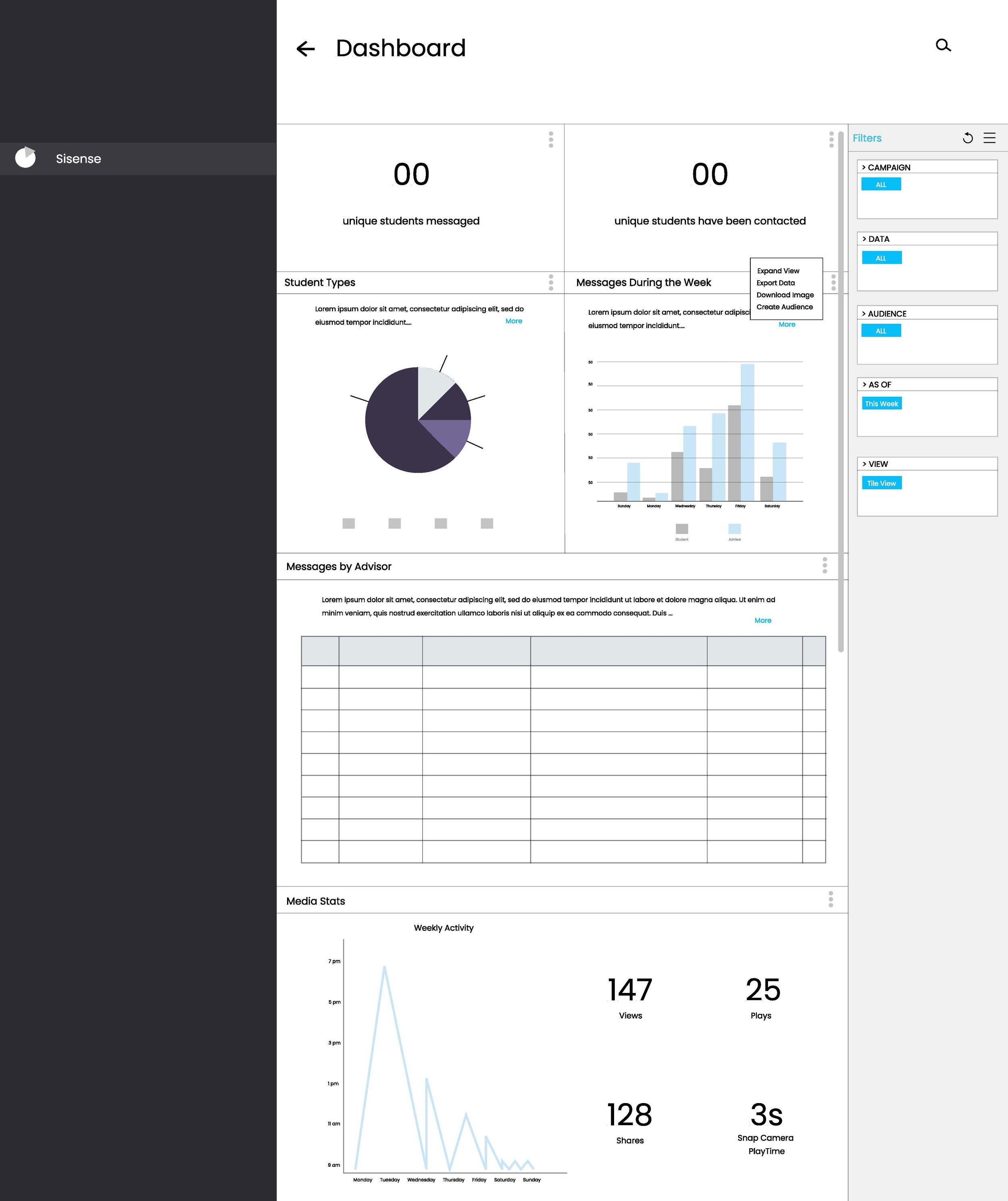
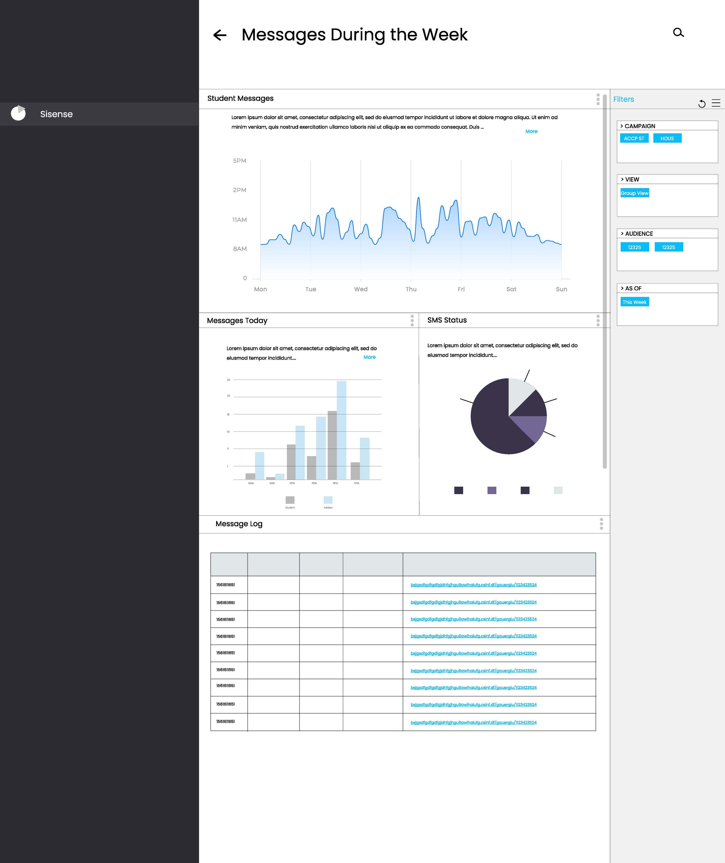
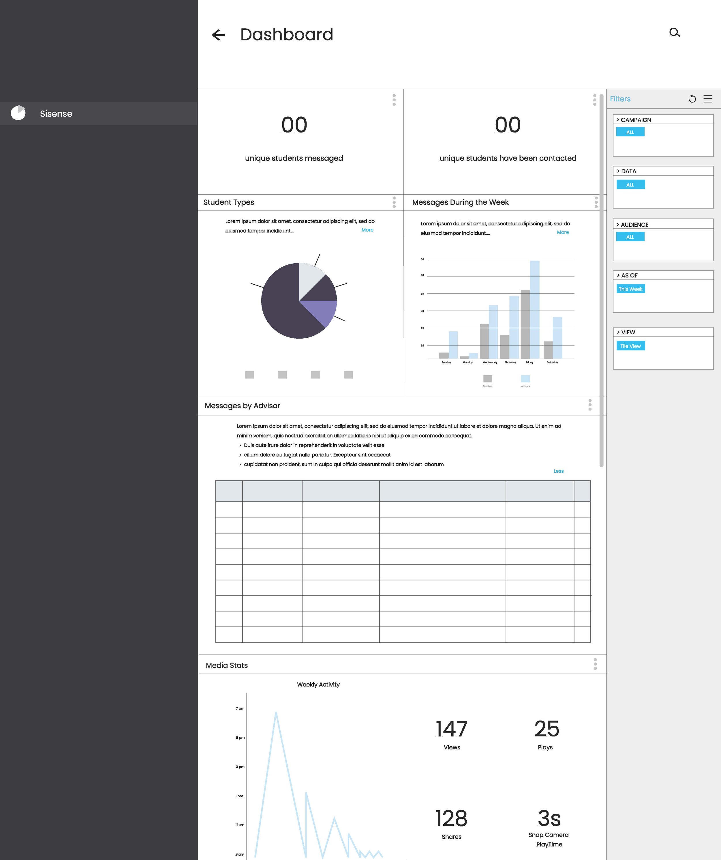
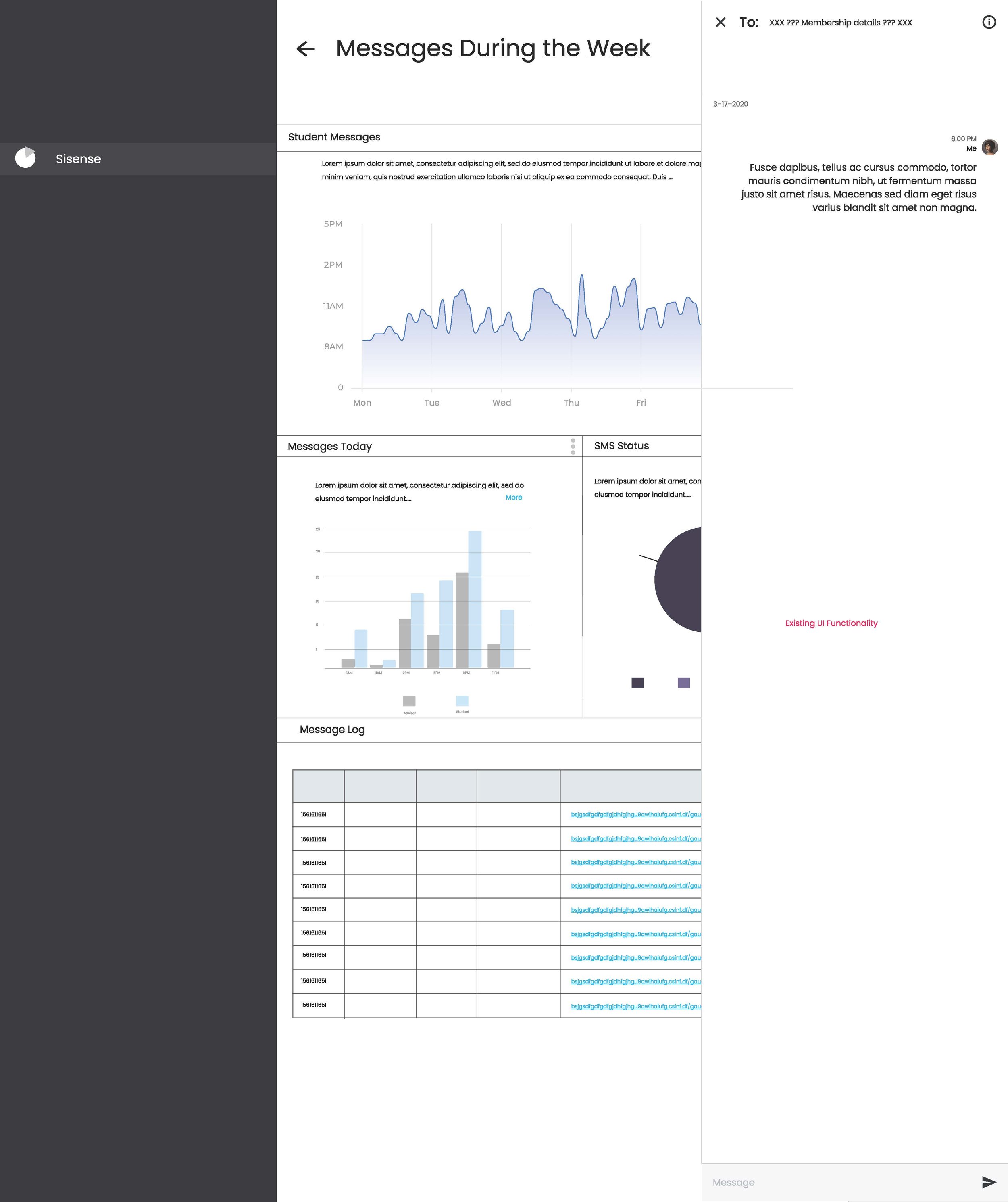
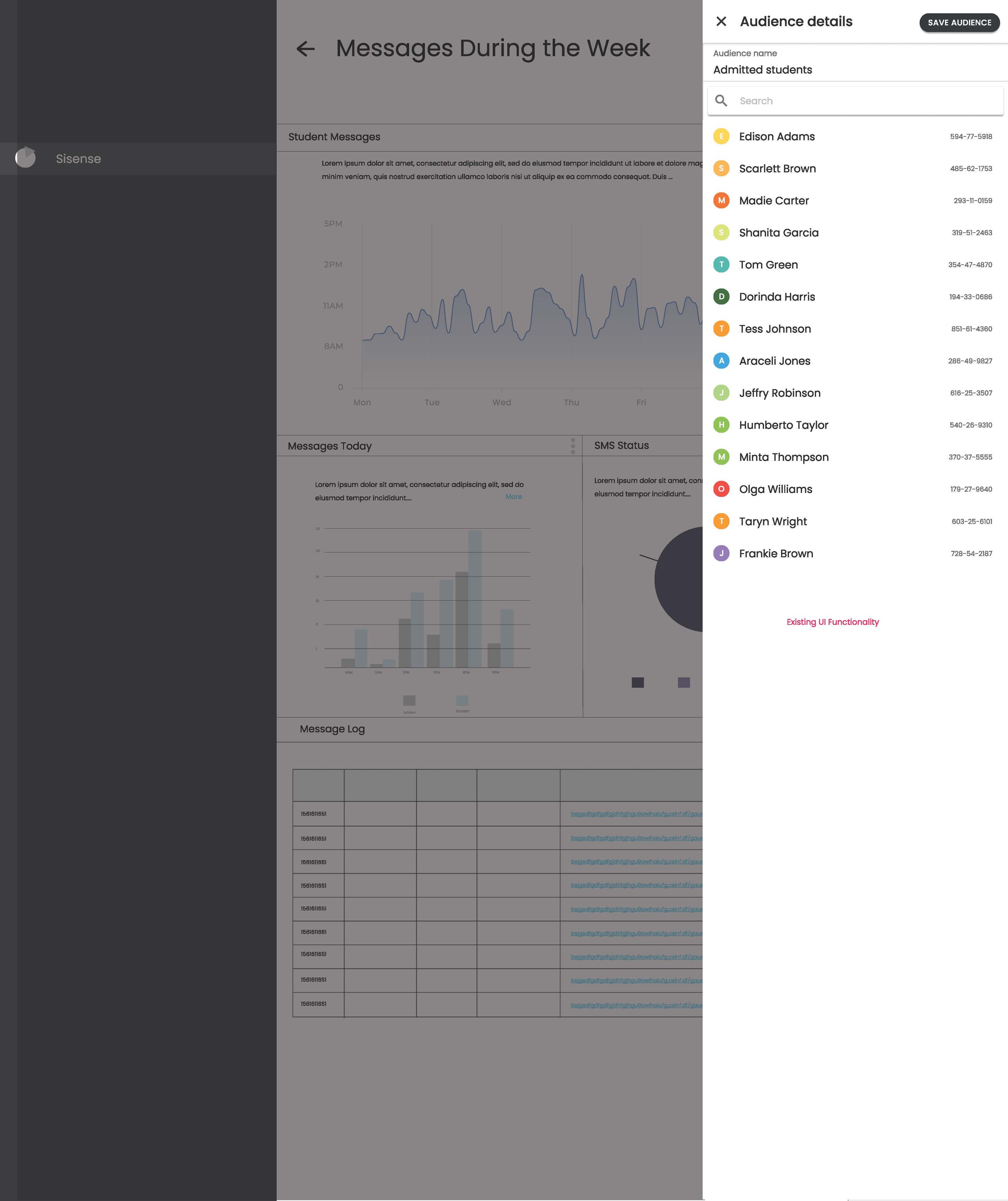
Initial wireframes were created as a deliverable to the third party data team to envision the layouts and goals of the company data visualizations. Wireframes included widgets of student messaging data points, audience division visualizations and messaging logs for easy access of previous student conversation.



Research
Interviews
There were three rounds of research done throughout the semester to better understand the needs of all users of the platforms. The three rounds were:
Interviews with Client Services (those who monitor general use and relay information from the client to internal company users)
Interviews with University Clients (i.e. universities who have purchased the product to use and seeking to provide input to improve their experience)
Interviews with internal employees that use the platform for other monitoring purposes.
Through these rounds of interviews, there were different needs that were unraveled by each “type” of user and the challenge for the summer was to recreate the product in a way that all users could use (depending on the license that they had) to carry out their daily activities. The reconstruction was to include views for internal employees and client services, such that they could monitor not only what their client sees but the activity that their client engages with. Then, the goal was to include a view that was much more detailed and had better data visualizations so that clients could look at the page more comprehensively and intuitively.
Competitive Evaluation
A deep competitive evaluation of all relevant platforms was completed in order to understand what other competing or similar SaaS platforms were able to do and what information they presented to their users. Main takeaways from the competitive evaluation were:
What data is being visualized and how (i.e. what is the best type of visualization for what types of data)
What filtering options currently exist, which should be forfeited, and which should be incorporated
Final prototype
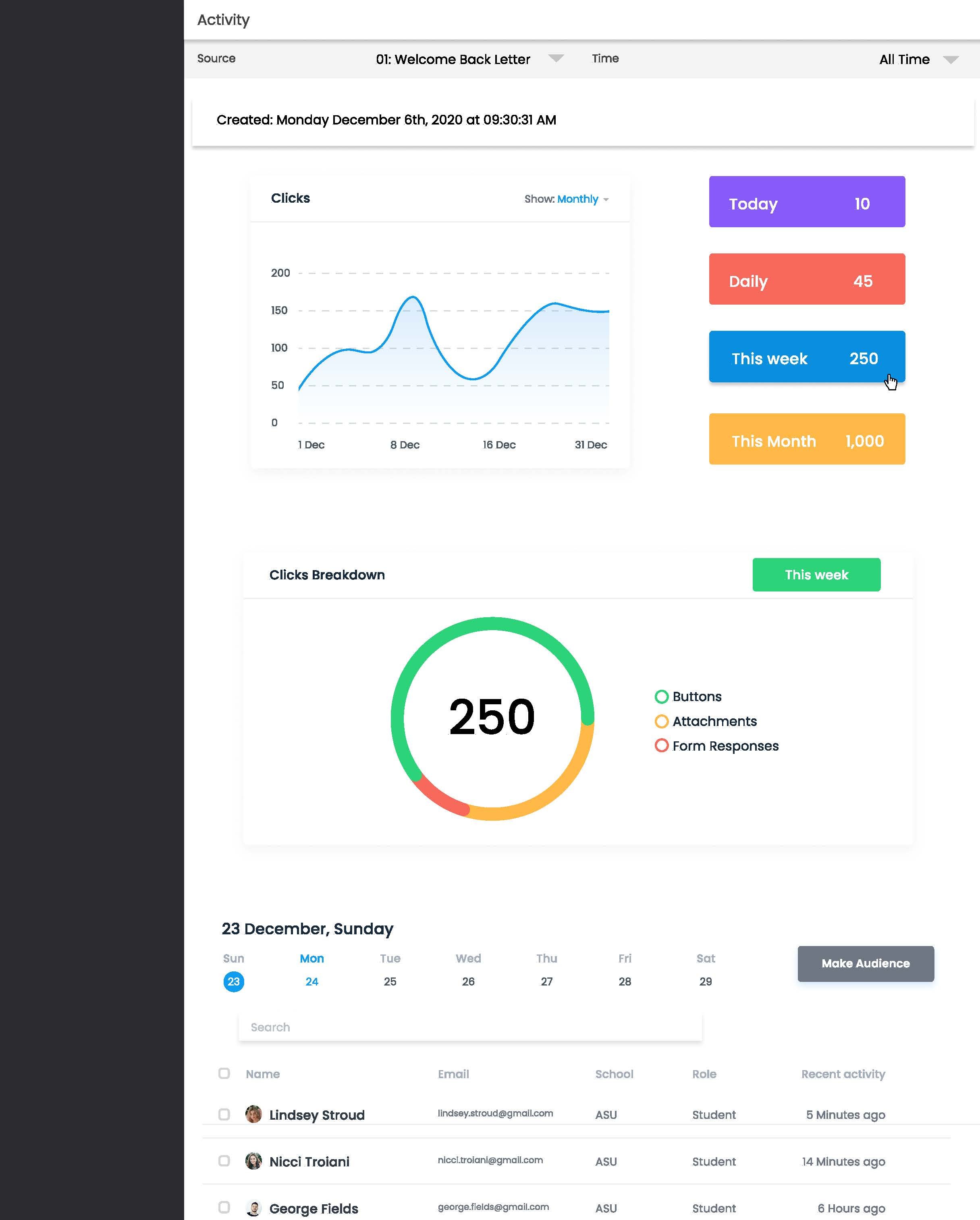
Below is the final prototype of the “activity” page of the client and the internal use page of the product. Changes made were:
Hover features of data visualizations for users to focus on particular data points
Use of AI features to collect and create summaries of each visualization to support more intuitive inferences from trends
Use of more color to distinguish groups and create a call to action
Expandable widgets to dive deeper into graphics
In-app messaging feature to all students/individuals relevant to the data for clients to reach out to if needed


